
I like a blended look, so I very rarely try to lay down a 100% texture on top of my base. Firstly, this helps provide a more constant look throughout the area, and secondly, the blending gives the texture a little added depth. There are some circumstances where you will want to use a 100% brush - for example, if one of the finer dirt textures is your base texture and you are making a cliff, the dirt texture looks a little strange as an underlay on the rock. I suppose for a more general rule, if there is a disparity between the size in terms of individual visible elements of the texture, it is more likely that you will want to use a 100% brush.
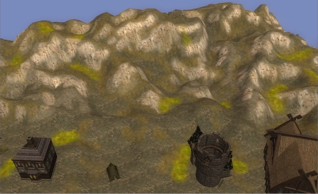
For this area, I have Dirt_05 as my main texture, and I've laid down some small swabs of Grass_23 and Rocky_03 over the landscape to start with, as they are my primary textures for this area. You can see the starting point in the screenshot below. Note that all the development screenshots have been taken from within the toolset and you can click on the screenshots for a larger image.
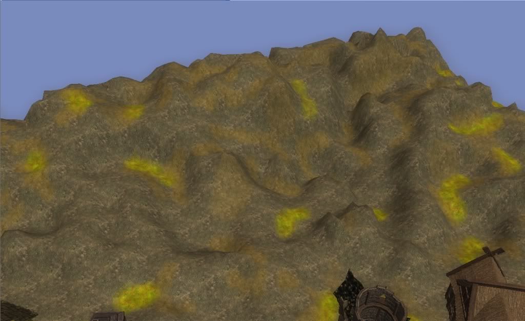
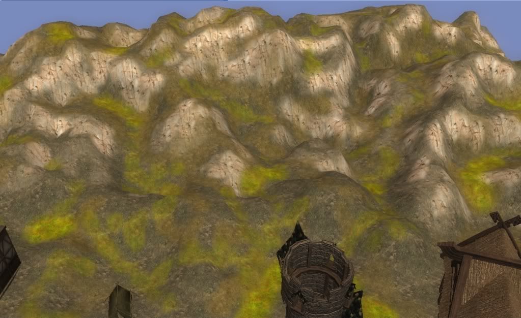
Use a fine brush for this initial step - I like to use the small brush or perhaps up to a 1-4 (1 inner, 4 outer) brush. Map out all the areas which you want to be strongly textured and lay this down. You may only dab a dot or two in some spots, but that's fine for now. The aim for this step is to lay down your promiment cliff faces with your cliff texture. I used Cliff_02 and 75% opcacity for this first step below.
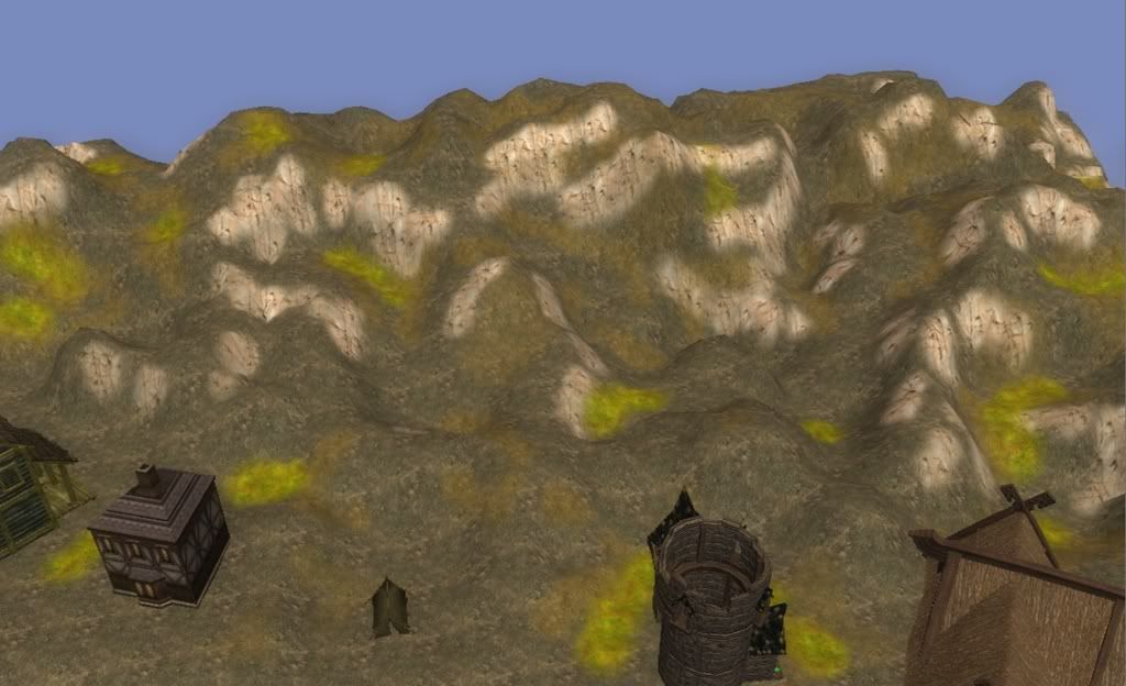
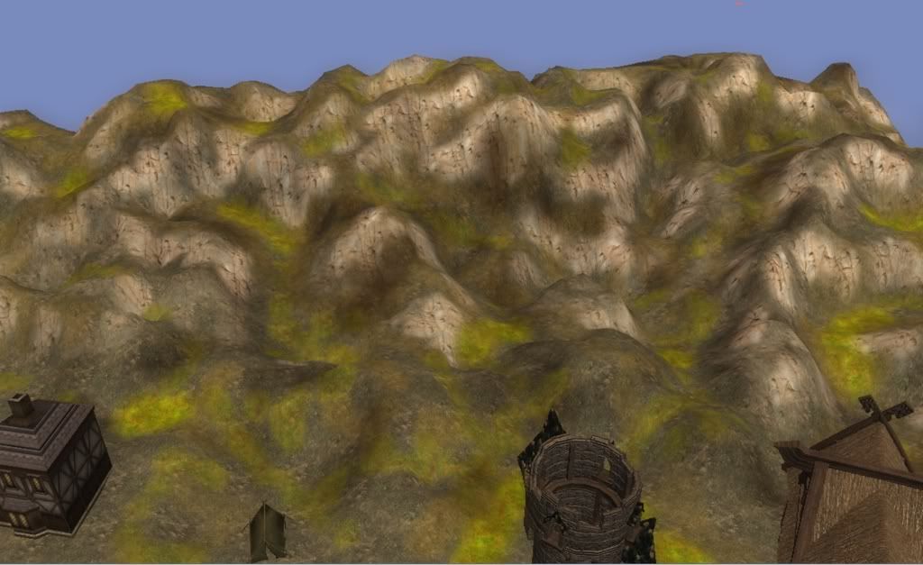
Next, drop the opacity of that texture by 15-30%. (I originally used 15%, but I've found that larger percentages work just as well, if not better). Consider using 25%-30% if you used a 100% brush to start with. Use a brush in the range 1-3 to 1-5, and trace around the edge of all the edges you just painted. You'll also want to extend it at points, for where you still want that texture applied, but at lesser intensity. For example, if the cliff is not as sheer, extend it further than the edges of your higher brush. For my screenshot below, I used 50% opacity.
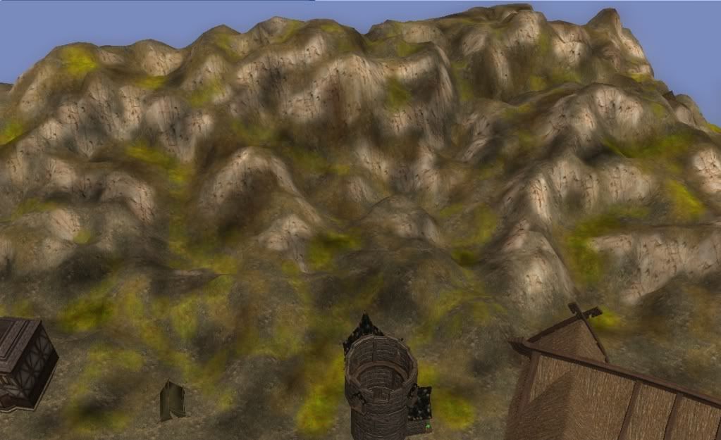
Then, we do the same again. Drop the opacity another 15%-30% (again, depending on your initial starting opacity) and you should be at most around the 40% mark, and using a brush in the 1-4 to 1-7 range. Again, trace the edges of your previous texturing, and extend a bit further where necessary. This is typically a reasonable level to end your texture blending. Note that the toolset results never look the same as the in game results (at least as far as I'm concerned they don't), so you may want another SMALL blend at around the 20% mark - though often it's not necessary because now it's time to colour. Typically the toolset blending appears less smooth than in the game itself. Additionally, the colouring we'll do later on means that any sharp differences will be less noticeable. The screenshot below is the final use of Cliff_02, this time at 25% opacity.
The next step is to lay down what I call the "buffer" texture. This is generally something that provides a contrast from your base texture, and is used to separate the cliff texture and the grass texture. You want to use an opacity in the range 30%-50%, and a brush since around 1-3 to 1-6. I must admint, I generally use 1-4 as my "workhorse" brush. Here, I've used Rocky_03, and a 35% opacity.
The final texture step is to use your grass texture, putting it down in most of the flatter areas that haven't yet been touched by another texture. Of course, you won't want to apply it everywhere, unless you're going for the appearance of grassy hills. Having an occasional slope with a generous helping of grass is nice as well, just as something to break up the landscape and make it a little more interesting. For my screenshot below, I've used Grass_23 at 40% opacity.
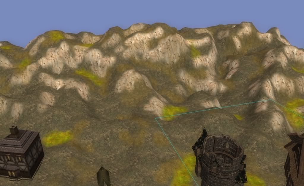
I can't emphasise how important colouring is. It brings an ordinary landscape to life. The first thing to do is to drop the opacity right down. Generally I find I don't want any more than 20% for normal work, and typically stick at about 10%. 1-4 is my staple brush as it provides a smoothed effect that avoids deep texture colour on a single vertex at smaller brush sizes. I find anything smaller can very easily make sharp edges that look very unappealing.
I'll only cover two colouring steps here, because although you can use further colouring afterwards to add more depth if you want, these two steps are sufficient for a nice effect. The first is the blending of the "buffer" texture. Basically the trick is to pick a dark, semi-satured brown (something that is almost in-between the last two series of browns in the colour picker) and paint around the edges of your buffer texture. The trick is to do it erratically, going in and out of the edge into the grass or the rock. It is also nice to apply it to some of the grass or rock areas as well, notice the cliff in the centre of the image that I've coloured heavily to get a dirty looking rock face.
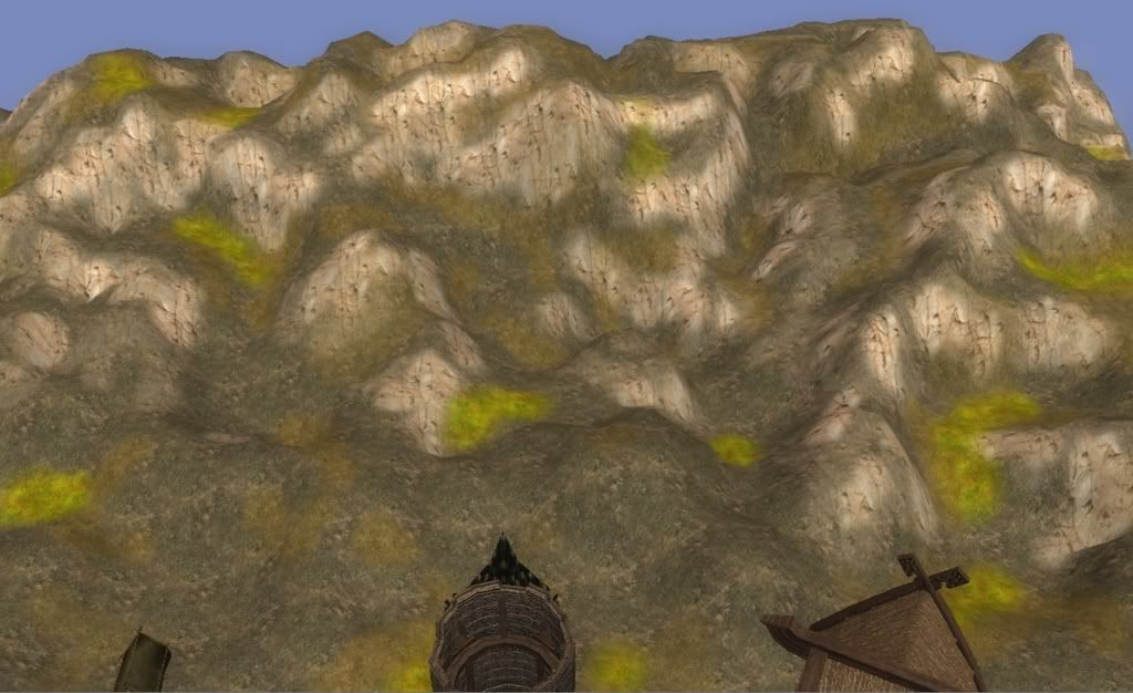
The second colouring step is to weather it using a colourless tint. I find that using 100% black has less desirable results than using something around an 80% grey. This steps is a bit more haphazard and artistic. It's a matter of colouring some things that are exposed, as well as some of the deeper gullies, and random patches about the landscape. There's no real hard and fast rule for this final step, except for making sure that you don't have large patches with even application of colouring.
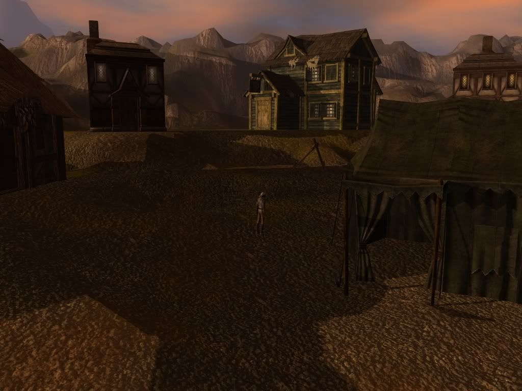
Of course, it would be remiss of me to have done all this work without actually showing you what it looks like in-game...
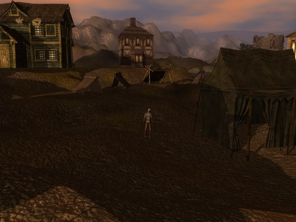
While it's only visible as the background, (and the foreground is by no means anywhere near completed) it gives an impressive vista to peer at from the edges of the map.
I hope this has been interesting to see my approach to area texturing, and that you've picked up a few tips and tricks that you find useful!
2 comments:
thanks for that - i always find these kind of posts interesting. I've noticed too the differenc ebetween the toolset and the game - but are you using the nomral mapped terrain option in the toolset?
1/4 is my standard too ;)
It seems I managed to not only turn that option off, but also remove it from the toolbar so that I didn't notice it wasn't on anymore!
I must confess I hadn't paid much attention to it before (though I've no idea why!), but it does make the toolset look a lot closer to the in-game appearance.
Post a Comment