Next, it's time for a status update. Things are proceeding nicely, with progress on the Rich Quarter moving along swiftly. With a couple of outdoor areas under my belt now, I'm finding the going much quicker, as I've got a bit of a workflow organised. I'm sure there's ways I can improve, but I feel like I'm working at a productive rate now. This is in definite contrast to my first exterior area, where I felt like I was struggling to do anything! Of course, the process is expedited by having a rough pencil sketch of the city layout, though I've been using that as a guideline rather than a hard and fast plan.
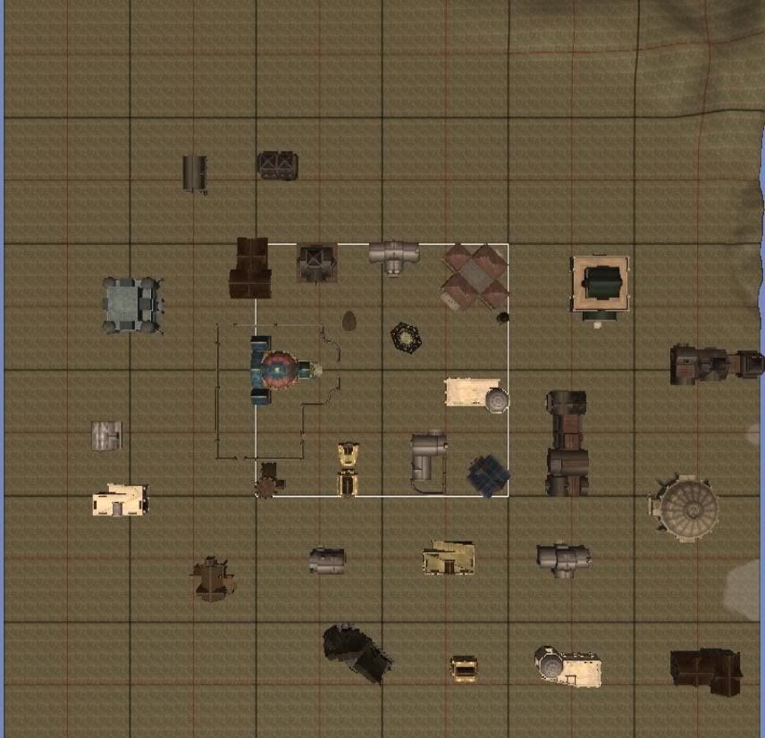
In the absence of any comments asking for particular types of screenshots, I've decided to give a few shots of the development of the Rich Quarter. Of course, it's not finished yet, but I thought I'd show its current evolutionary stages. The first stage was to lay down the buildings to get the core structure of the area.

Note that the first stage above already has a little bit of terrain/texture modification - while I wanted to get the core structure completed, those parts have been done in order to match up the edge of the area with the adjacent city district.
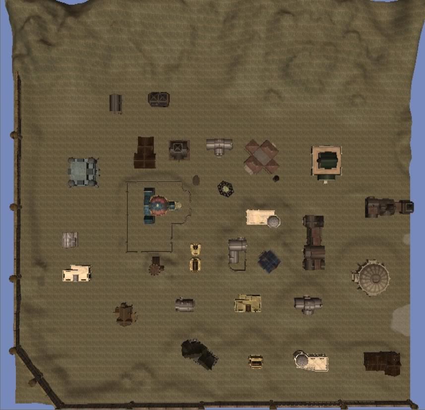
With the buildings placed, it was time to add a bit of depth/height to the equation, by modifying the terrain...

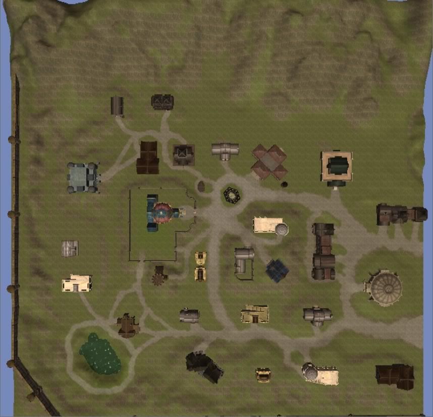
This step required some minor tweaking of building positions, though that is to be expected. A building doesn't simply have a door open out to a sharp drop... well, not barring some unusual circumstances, that is. The final step for the moment has been a first pass for texturing. While I've only currently used 3 textures, the area is starting to take shape. Of course, there still remains a lot of work to do in terms of additional textures and using the colour tool - which I use quite heavily because it is such a fantastic tool for creating variances in the look of the ground! Regardless, I feel like it has been a fairly solid start for one night's work...

Lastly, I like to comment on "realism". For those of you who aren't familiar with the toolset, that white box that appears in the first screenshot defines the walkable area for the player - so 8/9ths of the terrain that I've created cannot ever be accessed by the player! However, the work in creating that extra landscape is worth it, in my opinion, because it really gives a sense of verisimilitude. For me, it's so disheartening to see a well crafted city district (or any exterior area for that matter) spoiled by having the surrounding visible area taper off into a monotonous flat mono-textured plane. Sure, you can't explore that little pond or that building that looks remarkably like the ruins near West Harbour, but they make you feel like you're in a real city. Well, as real as a city in a fantasy setting can be, at least.

No comments:
Post a Comment